How to Layer Colors with Colored Pencils
Build Richer, Smoother, More Vibrant Artwork—One Layer at a Time
Welcome to the Creative Lab
If there is one technique that separates beginner coloring from artwork that looks rich, smooth, and professional, it’s layering.
Many people pick up a colored pencil and instinctively try to achieve the final color with one or two heavy strokes. Unfortunately, this often leads to streaks, flattened paper, and artwork that lacks depth.
Experienced colorists take a different approach.
Rather than forcing color into the paper, they patiently build it in transparent layers—allowing each pass to strengthen, enrich, and transform the one beneath it.
Think of a stained-glass window. Light doesn’t come from a single pane of colored glass; it gains its beauty from layers of color, light, and depth working together. Colored pencil artwork behaves in a surprisingly similar way.
In this lesson, you’ll discover why layering is one of the most powerful techniques you can learn, how it works, and how to use it to create artwork that feels more vibrant and realistic without pressing harder or buying expensive supplies.
By the end of this guide, you’ll have a repeatable system you can apply to almost every Escape Kingdom coloring page.
⭐ Why This Article Matters
Learning to layer colors is like learning to build a house.
Without a solid foundation, everything placed on top becomes unstable.
The same is true in colored pencil art.
Layering is the technique that supports:
- smoother blending,
- realistic shading,
- vibrant color,
- soft transitions,
- convincing depth,
- and beautiful texture.
If you skip layering and rely on heavy pressure instead, you’ll often find yourself unable to blend effectively or deepen your colors later.
Mastering layering gives you something far more valuable than darker color.
It gives you options.
You decide when to strengthen a shadow, soften an edge, or enrich a highlight because your paper still has room to accept more pigment.
This is why layering is considered one of the essential foundations of colored pencil art—and why it comes immediately after Understanding Pencil Pressure in the Escape Kingdom Creative Academy.
📚 In This Guide
- Why Layering Works
- The Escape Kingdom Layer Ladder™
- Transparent vs. Opaque Thinking
- Building Color Gradually
- Choosing Colors That Layer Well
- Common Layering Mistakes
- Practice Studio Projects
- Royal Artist’s Tips
- Frequently Asked Questions
- Continue Your Creative Journey
🌿 The Escape Kingdom Philosophy of Layering
At Escape Kingdom, we believe beautiful coloring is built—not rushed.
Every light layer is an opportunity to improve your artwork.
Every additional pass refines color, strengthens depth, and preserves flexibility.
Rather than asking:
“How can I make this darker?”
We encourage a different question:
“What can I add to make this richer?”
That small shift in thinking changes everything.
When you stop seeing colored pencils as tools for filling spaces and begin seeing them as tools for gradually building light, color, and atmosphere, your artwork begins to develop a depth that can’t be achieved with heavy pressure alone.
In the next section, we’ll introduce the Escape Kingdom Layer Ladder™, an original framework that transforms layering from a confusing technique into a simple, repeatable process you can use on every coloring page.
End of Module 1 (Part 1)
Coming in Module 2
You’ll discover the Escape Kingdom Layer Ladder™, a proprietary teaching framework that explains exactly how many layers to build, when to change colors, when to deepen shadows, and why professional colorists rarely think in terms of “one pencil, one color.”
We’ll also explore the concept of transparent color building, one of the least understood—but most transformative—skills in colored pencil art.
Module 2 — The Escape Kingdom Layer Ladder™: Building Color One Layer at a Time
Why Layering Feels Difficult at First
Many beginners think layering is simply adding one color on top of another.
In reality, layering is much more intentional than that.
Imagine listening to an orchestra.
Beautiful music isn’t created because every instrument plays as loudly as possible at the same time.
Instead, each instrument joins at the right moment, adding richness without overwhelming the others.
Layering colors works in much the same way.
Each layer has a purpose.
Some establish the foundation.
Some introduce warmth.
Some deepen shadows.
Some unify everything together.
The finished artwork is the result of many thoughtful decisions—not one heavy application of color.
🌿 The Escape Kingdom Layer Ladder™
At Escape Kingdom, we teach layering using a simple visual framework called the Layer Ladder™.
Rather than asking,
“How many layers should I use?”
ask instead,
“Which rung of the ladder am I on?”
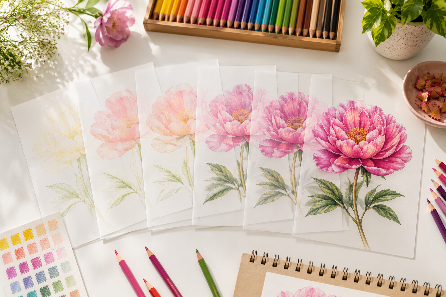
Every coloring project climbs the ladder gradually.
          ⭐ Rung 6
      Final Harmony

          ⭐ Rung 5
      Rich Depth

          ⭐ Rung 4
     Shadow Building

          ⭐ Rung 3
      Color Expansion

          ⭐ Rung 2
      Color Foundation

          ⭐ Rung 1
     Whisper Planning
Each rung prepares the artwork for the next.
Skipping several rungs almost always produces harsher, flatter results.
🌱 Rung One — Whisper Planning
Everything begins here.
This first layer is so light that many beginners think it isn’t accomplishing anything.
It actually accomplishes several important things.
It allows you to:
- establish the overall color,
- identify highlights,
- map future shadows,
- become familiar with the shape you’re coloring.
Your paper should still look mostly white.
That is a sign you’re doing it correctly.
Royal Artist’s Tip
Professional artists are often comfortable with artwork that looks unfinished for a surprisingly long time.
Patience is one of the hidden ingredients behind smooth coloring.
🍃 Rung Two — Color Foundation
Now begin strengthening your base color.
Instead of trying to create dramatic contrast, focus on creating consistency.
At this stage your goal is even coverage.
Ask yourself:
- Is the color smooth?
- Have I preserved the highlights?
- Does the paper still have enough tooth for future layers?
If the answer to all three is yes, you’re ready to continue.
🌸 Rung Three — Color Expansion
This is where your artwork begins to gain personality.
Instead of using only one pencil, introduce neighboring colors.
Imagine coloring a pink flower.
Rather than using only pink, you might gradually introduce:
- peach,
- coral,
- rose,
- soft magenta.
These colors work together to create a richer result than one pencil could achieve alone.
Escape Kingdom Insight
Nature rarely uses a single color.
Even a white flower contains subtle creams, blues, pinks, and soft grays.
The same principle applies to colored pencil art.
The richer your color relationships, the more natural your artwork will appear.
🌳 Rung Four — Shadow Building
Now begin creating depth.
Notice that this rung is not called “darkening.”
Many beginners immediately reach for black.
Professional colorists usually reach for:
- deeper versions of the existing color,
- complementary colors,
- cool shadow colors,
- or darker neighboring hues.
For example:
Instead of black on a red rose…
try:
- burgundy,
- crimson,
- plum,
- deep violet.
The shadows become richer and more believable.
💎 Rung Five — Rich Depth
At this stage your artwork begins to feel almost complete.
Rather than adding entirely new colors, begin strengthening relationships between the existing ones.
Look for opportunities to:
- soften transitions,
- deepen focal areas,
- enhance contrast,
- create visual rhythm.
Small adjustments now make a surprisingly large difference.
✨ Rung Six — Final Harmony
Many people assume this stage is simply burnishing.
Sometimes it is.
Often it isn’t.
Final Harmony is about asking:
“Does every part of this artwork belong together?”
You may discover that:
- one area needs another light glaze,
- a highlight should be softened,
- a shadow should be extended,
- a neighboring color should be repeated elsewhere to create balance.
This final stage gives the artwork unity.
The Secret Most Beginners Miss
Many people think layering means:
Blue.
↓
Green.
↓
Yellow.
↓
Done.
Actually…
Layering is more like having a conversation.
Each new layer responds to the one beneath it.
Sometimes you’ll return to the first color again.
Sometimes you’ll add a completely unexpected color.
Sometimes you’ll barely change anything at all.
The artwork tells you what it needs.
Transparent Thinking vs Opaque Thinking
One of the biggest mindset changes you’ll make is learning to think transparently.
Opaque Thinking
“I need this flower to be pink.”
So you press hard with one pink pencil.
Finished.
Transparent Thinking
“I’ll build this flower.”
First:
Soft peach.
Then:
Light pink.
Then:
Rose.
Then:
Warm magenta.
Then:
Tiny violet shadows.
Each layer influences the next.
The finished flower appears to glow because light reflects through many transparent layers of pigment.
👑 Royal Artist’s Tip
Imagine you’re painting with colored glass instead of paint.
Each layer should allow the previous one to remain visible.
If the previous layer disappears completely, you’re probably pressing too hard or adding too much pigment too quickly.
Escape Kingdom Practice Studio
Exercise 1 — The Color Ladder™
Choose one colored pencil.
Draw six identical rectangles.
Instead of changing pencils, create six increasingly rich colors by adding one gentle layer at a time.
Notice:
Layer One looks pale.
Layer Six looks rich.
Neither required heavy pressure.
Exercise 2 — Three-Pencil Flower
Choose:
- one light pencil,
- one medium pencil,
- one dark pencil.
Color a single flower petal.
Your challenge:
Never press harder than Breeze Pressure until the final touches.
Observe how richness comes from layering—not force.
Exercise 3 — Nature Detective
Go outside or study a flower photograph.
Choose one petal.
List every color you can find.
Most people discover:
- cream,
- yellow,
- peach,
- coral,
- pink,
- magenta,
- violet,
- gray.
That observation alone will transform how you choose colors.
Common Layering Mistakes
❌ Using One Pencil for Everything
Beautiful color usually comes from relationships between multiple colors.
❌ Rushing Through the First Layers
Your early layers determine the success of everything that follows.
❌ Pressing Hard to Save Time
Heavy pressure reduces your ability to continue building color.
❌ Forgetting to Step Back
Every few minutes, place your pencil down and view the artwork from a short distance.
You’ll often notice opportunities to improve balance and depth.
Escape Kingdom Reflection
Layering isn’t about making color darker.
It’s about making color more interesting.
Every gentle layer adds another voice to the artwork.
Some whisper.
Some sing.
Some create harmony.
When they work together, your coloring begins to feel less like filling spaces and more like bringing an illustration to life.
That transformation is one of the defining moments in every colorist’s journey.
Coming in Module 3
In the next lesson, you’ll discover how different colors interact when layered, including:
- why blue over yellow doesn’t always create the green you expect,
- how warm and cool colors influence one another,
- when to layer complementary colors,
- how to create luminous shadows,
- and the Escape Kingdom Color Weaving™ Method, an original teaching system that will help you build vibrant, realistic color without muddying your artwork.
Module 3 – The Escape Kingdom Color Weaving™ Method: Choosing the Right Colors for Every Layer
Layering Isn’t Just About More Color
By now, you’ve learned that beautiful coloring doesn’t come from pressing harder—it comes from building color gradually.
But there’s another secret that separates beginner coloring from artwork with remarkable depth:
Professional colorists rarely build a color using only one pencil.
Instead, they carefully combine several related colors, allowing each one to influence the next.
At Escape Kingdom, we call this Color Weaving™ because you’re not simply stacking colors—you are weaving them together into a richer, more harmonious whole.
Imagine weaving a beautiful tapestry.
Each thread is attractive on its own.
But together they create something far more beautiful than any single thread ever could.
Layering colors works exactly the same way.
🌈 The Escape Kingdom Color Weaving™ Method
Rather than thinking:
One object = One pencil
Think:
One object = A family of colors working together.
Every object you color can usually be built using three types of colors.
🌞 Foundation Colors
These establish the overall appearance.
Examples:
- soft peach
- light yellow
- pale blue
- light green
These colors create the “first impression.”
🌿 Supporting Colors
These strengthen the object.
Examples:
- rose
- olive
- turquoise
- warm gray
Supporting colors add richness without overpowering the foundation.
🌙 Harmony Colors
These unify everything.
Harmony colors often include:
- deeper versions of the main color,
- neighboring colors,
- subtle complementary colors,
- gentle neutrals.
Rather than standing out, they quietly bring the artwork together.
Why Nature Is Your Best Teacher
Look closely at almost anything in nature.
A leaf isn’t simply green.
It may contain:
- yellow,
- lime,
- emerald,
- olive,
- teal,
- blue,
- brown,
- gray.
The same is true of flowers, feathers, fur, skies, and skin.
When you begin looking for these subtle color relationships, you’ll naturally start choosing better layering combinations.
🌸 Example 1 – Building a Pink Rose
Many beginners choose:
Pink.
Done.
Instead, try weaving together:
Layer 1
Soft peach
↓
Layer 2
Light pink
↓
Layer 3
Rose
↓
Layer 4
Magenta
↓
Layer 5
Deep plum
↓
Final touches
Small amounts of crimson where the shadows are deepest.
The finished flower appears richer because every layer contributes something unique.
🍃 Example 2 – Building a Green Leaf
Instead of:
Dark green.
Finished.
Try:
Light yellow-green
↓
Grass green
↓
Olive
↓
Forest green
↓
Tiny touches of blue-green in cooler shadow areas
Notice how the leaf begins to feel alive rather than flat.
☁️ Example 3 – Building a Blue Sky
Many beginners choose one blue pencil.
Professional colorists often layer:
Very pale blue
↓
Cerulean
↓
Sky blue
↓
Blue violet near the upper sky
↓
Warm cream near the horizon
These subtle changes create atmosphere.
Warm Colors and Cool Colors
Every color has a temperature.
Understanding this makes layering far easier.
Warm colors
Examples:
- yellow
- orange
- coral
- warm red
- golden green
Warm colors tend to:
- feel closer,
- attract attention,
- create sunlight.
Cool colors
Examples:
- blue
- violet
- cool green
- blue-gray
Cool colors tend to:
- recede,
- create distance,
- suggest shade.
Royal Artist’s Tip
Instead of asking:
“Which green should I use?”
Ask:
“Is this leaf warm or cool?”
That single question often leads to much more realistic coloring.
Neighboring Colors
One of the safest layering strategies is using neighboring colors.
Imagine a color wheel.
Colors beside one another naturally blend well.
Examples:
Yellow
↓
Yellow-green
↓
Green
↓
Blue-green
These transitions usually appear smooth and harmonious.
Complementary Colors
Complementary colors sit opposite one another on the color wheel.
Examples:
- red / green
- blue / orange
- yellow / purple
Many beginners avoid them.
Professional artists often use them carefully.
Why?
Because tiny amounts of complementary colors create:
- richer shadows,
- natural contrast,
- less artificial-looking color.
Example
Instead of darkening yellow with black…
Try adding tiny amounts of soft violet.
The result often feels warmer and more natural.
👑 Royal Artist’s Insight
Complementary colors should usually whisper—not shout.
Their job is to enrich existing colors rather than replace them.
The Danger of Muddy Color
Layering doesn’t mean adding every color you own.
Too many unrelated colors can produce dull, muddy artwork.
If your colors suddenly lose their brightness, ask yourself:
- Have I added too many different hues?
- Have I stopped preserving the original foundation?
- Am I layering with purpose—or simply experimenting?
Purposeful layering almost always produces cleaner results.
Escape Kingdom Practice Studio
Exercise 1 – Three Ways to Build Red
Draw three identical circles.
Circle One
Use one red pencil only.
Circle Two
Use:
Light pink
↓
Red
↓
Crimson
Circle Three
Use:
Peach
↓
Pink
↓
Red
↓
Magenta
↓
Crimson
Compare the richness.
The third circle will often appear more vibrant and dimensional.
Exercise 2 – The Nature Palette Hunt™
Find:
- a leaf,
- a flower,
- or a feather.
Write down every color you can identify.
Don’t stop after the obvious ones.
Most objects contain far more colors than we first notice.
Exercise 3 – Build Without Black
Choose one object.
Create its shadows without using black.
Instead:
Use:
- darker neighboring colors,
- complementary colors,
- deeper versions of the base color.
Observe how much more natural the result becomes.
Common Color Layering Mistakes
❌ Using only one pencil
Objects in nature are rarely one color.
❌ Choosing shadows that are too dark too soon
Build gradually.
❌ Ignoring color temperature
Warm and cool colors create depth.
❌ Adding random colors
Every layer should have a purpose.
❌ Copying colors instead of observing them
Observation always beats memory.
🌿 Escape Kingdom Reflection
Layering isn’t only about adding more pigment.
It’s about building relationships.
Each new color should strengthen the ones beneath it.
Sometimes the smallest additions create the greatest transformation.
When you begin seeing colors as members of the same family rather than isolated pencils, your artwork naturally becomes richer, softer, and more believable.
That’s one of the quiet joys of colored pencil art—you stop asking,
“Which pencil should I use?”
and begin asking,
“Which color belongs here next?”
That simple change in perspective opens the door to more expressive, more confident coloring.
Coming in Module 4
Now that you know how to choose colors for layering, it’s time to combine those layers into seamless artwork.
In the next module you’ll learn:
- why some layered colors blend effortlessly while others remain streaky,
- how to recognize the perfect moment to stop layering and begin blending,
- how pencil pressure and layering work together,
- and the Escape Kingdom Layer-to-Blend Bridge™, an original framework that helps you transition from building color to creating smooth, professional-looking finishes without overworking your paper.
This module will connect everything you’ve learned so far and prepare you for the next cornerstone article, How to Blend Colored Pencils
Module 4 – Bringing Layers to Life: The Escape Kingdom Layer-to-Blend Bridge™
Building Is Only Half the Journey
Imagine constructing a beautiful stone castle.
You’ve carefully laid every brick.
The walls are straight.
The towers are strong.
But there are still visible gaps between the stones.
Now imagine a master craftsman carefully finishing the masonry so everything looks seamless.
That’s what happens between layering and blending.
Many beginners assume these are the same technique.
They’re not.
Layering builds color.
Blending unifies it.
Knowing when to stop layering and begin blending is one of the biggest milestones in becoming a confident colorist.
🌉 The Escape Kingdom Layer-to-Blend Bridge™
At Escape Kingdom, we think of layering and blending as two sides of the same bridge.
Whisper Layers
        ↓
Foundation Layers
        ↓
Color Building
        ↓
Rich Layering
═══════════════════════
🌉 Layer-to-Blend Bridge™
═══════════════════════
Soft Blending
        ↓
Refining Details
        ↓
Final Harmony
Many beginners either:
- cross the bridge too early, or
- never cross it at all.
The result is artwork that looks either unfinished or overworked.
How Do You Know You’re Ready to Blend?
Ask yourself these five questions.
✅ 1. Is the Color Rich Enough?
If your artwork still looks pale…
keep layering.
Blending cannot create color that isn’t already there.
It can only soften and unify existing pigment.
✅ 2. Are Your Shadows Established?
Don’t blend before your shadows are in place.
Otherwise you’ll simply blur unfinished work.
✅ 3. Are Your Highlights Protected?
Once heavy blending begins, recovering bright highlights becomes much more difficult.
Protect them first.
✅ 4. Is the Paper Still Accepting Pigment?
If your paper still has visible tooth, you have room for more layering.
If it feels nearly full, blending may be the next logical step.
✅ 5. Does the Artwork Already Look Good?
This surprises many beginners.
Blending should improve good artwork.
It shouldn’t rescue weak layering.
👑 Royal Artist’s Tip
If you’re hoping blending will fix uneven coloring, it’s usually better to add another light layer first.
Most blending problems are actually layering problems.
The Three Signs of Complete Layering
Before blending, your artwork should already have:
🌿 Balanced Color
No section should appear noticeably unfinished.
🌸 Smooth Value Changes
Light and shadow should transition naturally.
🌞 Clear Light Direction
The viewer should immediately understand where the light is coming from.
If these three elements are missing, continue layering.
Why Beginners Blend Too Soon
Most people become impatient.
After two or three layers they think:
“Now I’ll blend everything.”
Professional colorists often build many more layers before serious blending begins.
Think of layering as preparing ingredients before baking.
If the ingredients aren’t ready…
the oven won’t fix the recipe.
The Escape Kingdom 70–20–10 Rule™
This is a simple guideline—not a strict formula—but it’s a helpful way to think about your coloring process.
Approximately:
- 70% of your time should be spent building layers.
- 20% refining and adjusting those layers.
- 10% blending and finishing.
Many beginners reverse this ratio.
They spend very little time layering and expect blending to do most of the work.
The result is often disappointing.
Layering and Pressure Work Together
Think back to the previous cornerstone lesson:
Understanding Pencil Pressure.
Layering and pressure are partners.
| Layering Stage | Recommended Pressure |
|---|---|
| First layer | Whisper |
| Building layers | Whisper → Breeze |
| Developing shadows | Breeze → Forest |
| Final refinement | Selective Crown |
Notice something?
Heavy pressure appears only near the end.
This preserves the paper’s texture and leaves room for future adjustments.
The Importance of Patience
Professional-looking coloring is rarely rushed.
Instead of asking:
“How fast can I finish?”
Try asking:
“How much can I improve this layer before adding the next?”
That small change in mindset leads to smoother, richer artwork.
Escape Kingdom Practice Studio
Exercise 1 – Blend or Layer?
Draw six identical circles.
Color each using only two pencils.
Before blending each one, stop and ask:
- Is it rich enough?
- Are the shadows complete?
- Are the highlights protected?
Only blend the circles that meet all three conditions.
Compare the results.
Exercise 2 – The Patience Test™
Choose a flower petal.
Count every layer aloud.
Layer 1…
Layer 2…
Layer 3…
Continue until at least Layer 8.
Most beginners discover they could have stopped too early.
Exercise 3 – Bridge Builder™
Choose one object.
Color it twice.
Version One
Blend after only two layers.
Version Two
Layer until you’re completely satisfied.
Then blend.
Place both versions side by side.
The second version usually appears:
- smoother,
- richer,
- more dimensional,
- more realistic.
Common Bridge Mistakes
❌ Crossing Too Early
Blending before enough color exists.
❌ Crossing Too Late
Adding endless layers when the artwork is already ready for refinement.
❌ Forgetting to Evaluate
Pause often.
Your artwork changes with every layer.
❌ Blending Everything Equally
Not every area requires the same amount of blending.
Leaves.
Hair.
Petals.
Stone.
Fabric.
Each surface behaves differently.
👑 Royal Artist’s Insight
Some of the most beautiful artwork retains subtle evidence of individual layers.
Perfection doesn’t always mean eliminating every pencil stroke.
Sometimes a hint of texture makes artwork feel more alive.
Learn to ask:
“Does this area need blending—or does it simply need another thoughtful layer?”
The Escape Kingdom Observation Exercise™
Find a high-quality botanical illustration or photograph.
Look closely.
Can you identify:
- areas where colors gradually build?
- areas where transitions are perfectly smooth?
- areas where texture has intentionally been preserved?
This exercise trains your artistic eye as much as your hand.
🌿 Escape Kingdom Reflection
Layering teaches patience.
Blending teaches restraint.
Together they create harmony.
The goal isn’t to erase every trace of your pencil.
The goal is to let every layer contribute to a finished piece that feels natural, luminous, and full of depth.
As your confidence grows, you’ll stop thinking of layering and blending as separate techniques.
Instead, they’ll become two parts of the same creative conversation.
Coming in Module 5
In the next module, you’ll discover the Escape Kingdom Layering Projects™, where you’ll apply everything you’ve learned to complete flowers, leaves, hair, skies, and other real-world subjects.
You’ll also learn:
- how different textures change your layering strategy,
- when to intentionally leave visible layers,
- how to avoid overworking your paper,
- and the Royal Layering Workflow™, a repeatable step-by-step process you can use on virtually every Escape Kingdom coloring page.
This practical module is where the concepts from the first four lessons become lasting artistic habits, helping you approach every new coloring page with confidence and purpose.
Module 5 – The Royal Layering Workflow™: Practical Projects for Rich, Luminous Color
Turning Knowledge into Habit
By now you’ve learned:
- why layering matters,
- how the Escape Kingdom Layer Ladder™ works,
- how to choose colors that work together,
- and when to transition from layering to blending.
Now it’s time to bring everything together.
Reading about layering is valuable.
Practicing layering is transformative.
This module introduces the Escape Kingdom Royal Layering Workflow™, a repeatable process you can use on nearly every coloring page—whether you’re coloring a simple daisy or an elaborate fantasy illustration.
The goal isn’t simply to finish a page.
The goal is to develop habits that produce beautiful results every time.
👑 The Escape Kingdom Royal Layering Workflow™
Think of this workflow as your roadmap.
Whenever you begin a new coloring page, move through these seven stages.
Observe
      ↓
Plan
      ↓
Build
      ↓
Expand
      ↓
Deepen
      ↓
Refine
      ↓
Evaluate
With practice, these stages become second nature.
👀 Step 1 – Observe Before You Color
Before touching your pencils to the paper, spend a minute looking.
Ask yourself:
- Where is the light source?
- Which objects are closest?
- Which areas should remain brightest?
- Where will the darkest shadows be?
- Which colors dominate the scene?
This simple habit prevents many common mistakes.
🎨 Step 2 – Plan Your Palette
Rather than choosing one pencil, choose a family of colors.
For example, if you’re coloring a sunflower:
- Pale Yellow
- Golden Yellow
- Yellow Ochre
- Warm Orange
- Burnt Sienna
By planning ahead, your layers will feel intentional rather than random.
🌬 Step 3 – Build the Foundation
Using Whisper Pressure, apply your first layer.
Remember:
Your goal isn’t bold color.
Your goal is consistency.
Leave room for future layers.
🌿 Step 4 – Expand the Color
Now begin weaving additional colors into the artwork.
Introduce:
- warmer tones,
- cooler tones,
- neighboring colors,
- subtle variations.
Each layer should strengthen what came before it.
🌳 Step 5 – Deepen the Shadows
Only now should stronger values begin appearing.
Rather than reaching for black, deepen the artwork using:
- darker versions of your existing colors,
- complementary colors,
- cool or warm shadow hues.
This creates richer, more believable depth.
✨ Step 6 – Refine the Details
Look for opportunities to improve:
- edges,
- texture,
- transitions,
- focal points.
Many artists discover that one thoughtful layer improves the artwork more than several hurried ones.
👀 Step 7 – Evaluate Before Finishing
Put your pencils down.
Step away for a few minutes.
Return with fresh eyes.
Ask yourself:
- Is every area equally finished?
- Have I preserved enough highlights?
- Are the shadows balanced?
- Does anything feel too flat?
- Would another gentle layer improve the piece?
Sometimes the best decision is to stop.
🌸 Project One – Layering a Flower Petal
Flowers are one of the best subjects for practicing layering because they naturally contain subtle color transitions.
Suggested Palette
- Cream
- Soft Peach
- Light Pink
- Rose
- Magenta
- Plum
Workflow
- Apply a cream base layer.
- Add soft peach where the petals curve.
- Build light pink across the petal.
- Strengthen with rose.
- Introduce magenta into deeper folds.
- Add plum only in the darkest shadows.
- Blend selectively if needed.
Notice how no single pencil dominates.
The richness comes from their relationship.
🍃 Project Two – Layering a Leaf
Leaves provide an excellent opportunity to practice depth.
Suggested Palette
- Yellow Green
- Grass Green
- Olive
- Forest Green
- Blue Green
Workflow
Begin lightly.
Allow each layer to follow the natural direction of the veins.
Instead of covering previous colors, let them remain visible.
The finished leaf should contain subtle shifts rather than one solid green.
☁️ Project Three – Layering a Sky
Large backgrounds teach patience.
Suggested Palette
- Pale Blue
- Sky Blue
- Cerulean
- Blue Violet
- Warm Cream (near the horizon)
Work slowly using broad, even strokes.
Resist the temptation to create full saturation immediately.
Several light passes almost always produce smoother skies than one heavy application.
👩 Project Four – Layering Hair
Hair is built through value changes rather than individual strands.
Suggested Palette
For brown hair:
- Light Tan
- Golden Brown
- Chestnut
- Burnt Umber
- Dark Sepia
Layer with the direction of the hair growth.
Allow the lighter colors to remain visible beneath the darker strands.
This creates movement and shine.
🐦 Project Five – Layering Feathers
Feathers combine softness with structure.
Instead of coloring each feather identically:
- begin with soft foundation colors,
- strengthen only selected feathers,
- deepen shadows beneath overlapping areas.
The variation creates realism.
👑 Royal Artist’s Tip
Every object doesn’t need the same number of layers.
A smooth flower petal may benefit from ten or more delicate layers.
A rustic tree trunk might look more convincing with fewer layers and more visible texture.
Let the subject guide your approach.
Escape Kingdom Practice Studio
Exercise 1 – One Subject, Two Methods
Choose one flower.
Version A
Use only one colored pencil.
Version B
Use five carefully layered colors.
Compare:
- depth,
- richness,
- realism,
- overall harmony.
The difference is often remarkable.
Exercise 2 – The Five-Layer Challenge™
Choose any object.
Promise yourself that you won’t consider it finished until you’ve applied at least five thoughtful layers.
This simple exercise encourages patience and builds confidence.
Exercise 3 – Layer Journal
After each coloring session, write:
- Which colors worked well together?
- Which combinations surprised you?
- Where did you stop too early?
- Where did you overwork the paper?
Keeping a simple journal helps you recognize patterns and improve more quickly.
Common Workflow Mistakes
❌ Skipping the planning stage
Choosing colors as you go often leads to muddy combinations.
❌ Adding dark colors too soon
Depth should develop gradually.
❌ Treating every object the same
Different textures require different layering strategies.
❌ Chasing perfection
Beautiful artwork often retains subtle evidence of the artist’s hand.
A little texture can add character.
🌿 Escape Kingdom Reflection
Layering is more than a technique.
It’s a mindset.
Each layer is an opportunity to observe more carefully, make better decisions, and strengthen your artwork with intention rather than force.
When you begin trusting the process, you’ll notice something remarkable.
Coloring becomes less stressful.
Instead of worrying about getting everything right immediately, you’ll know that each new layer gives you another chance to improve.
That’s one of the quiet joys of colored pencil art.
Patience doesn’t slow your progress.
It becomes the very thing that creates it.
Coming in Module 6
The final module completes this cornerstone guide with:
- The Escape Kingdom Layering Troubleshooting Guide™
- Frequently Asked Questions
- The biggest myths about layering
- A complete layering checklist
- Related Creative Lab lessons
- Related Royal Library resources
- Printable worksheet ideas
- Pinterest content ideas
- Continue Your Creative Journey
- Final Royal Artist’s encouragement
We’ll also conclude with a concise Key Takeaways section that reinforces the most important lessons from the entire guide.
Module 6 – Troubleshooting, Frequently Asked Questions & Continue Your Creative Journey
Congratulations!
If you’ve completed this guide from beginning to end, you’ve mastered one of the most important skills in colored pencil art.
You now understand:
- why layering creates richer artwork than heavy pressure,
- how to build color gradually,
- how to select colors that work together,
- when to move from layering to blending,
- and how to apply a repeatable workflow to almost any coloring page.
Perhaps the most important lesson is this:
Beautiful coloring is rarely created in a single pass.
It grows—one thoughtful layer at a time.
👑 The Escape Kingdom Layering Troubleshooting Guide™
Almost every colorist encounters challenges while learning to layer.
Fortunately, most problems have simple solutions.
| Problem | Likely Cause | Escape Kingdom Solution |
|---|---|---|
| Colors look flat | Too few layers | Build additional light layers before increasing pressure. |
| Artwork looks muddy | Too many unrelated colors | Limit your palette to neighboring or harmonious colors. |
| Paper won’t accept more pigment | Burnished too early | Reserve heavy pressure and burnishing for the final stages. |
| Blending looks uneven | Layer foundation is incomplete | Continue layering before attempting to blend. |
| Shadows appear harsh | Used black too early | Deepen shadows with darker related colors or complementary colors. |
| Highlights disappeared | Colored over them too soon | Preserve highlights from the first layer and build around them. |
| Artwork feels unfinished | Stopped layering too early | Add another thoughtful layer before deciding you’re finished. |
The Five Biggest Myths About Layering
Myth #1
“Layering means pressing harder with each layer.”
Not necessarily.
Most layers should still be applied with gentle, controlled pressure.
Color richness comes from repetition, not force.
Myth #2
“More layers always make better artwork.”
Quality matters more than quantity.
Every layer should have a purpose.
Adding unnecessary layers can reduce clarity and vibrancy.
Myth #3
“I should finish one section before moving to another.”
Sometimes.
But many artists work across several areas to keep the overall color balance harmonious.
Myth #4
“Black is the best shadow color.”
Often it isn’t.
Many natural shadows are richer when created using deeper versions of the existing colors or carefully chosen complementary colors.
Myth #5
“Layering is only for advanced artists.”
Quite the opposite.
Layering is one of the first habits beginners should develop because it improves nearly every other colored pencil technique.
⭐ Key Takeaways
Before moving on, remember these core principles:
- Build color gradually rather than trying to achieve full saturation immediately.
- Work with a family of related colors instead of relying on a single pencil.
- Preserve the paper’s tooth by using light pressure for most layers.
- Observe your subject carefully—nature rarely uses just one color.
- Let each layer contribute something unique.
- Blend only after your layers are well established.
- Slow, intentional progress almost always produces smoother, richer artwork.
If you remember nothing else from this guide, remember this:
Layering is the art of making small improvements that become extraordinary when combined.
Frequently Asked Questions
How many layers should I use?
There isn’t a fixed number.
Some simple objects may need only four or five layers.
More detailed illustrations may benefit from ten or more.
Instead of counting layers, ask:
“Can another gentle layer improve this area?”
Should every layer use a different color?
No.
Sometimes repeating the same color helps unify previous layers.
Other times introducing a neighboring color adds richness.
The decision depends on what the artwork needs.
What if my colors start looking dull?
Pause and evaluate:
- Have I added too many unrelated colors?
- Have I preserved enough highlights?
- Have I burnished too soon?
Often, simplifying your palette restores vibrancy.
Is layering useful with inexpensive colored pencils?
Absolutely.
In fact, layering often helps economical pencils perform better because multiple light applications create smoother, richer color than one heavy application.
Can I layer over blended areas?
Sometimes—but only if the paper still has enough tooth to accept more pigment.
If the surface feels slick or shiny, additional layers may no longer adhere well.
Should I layer every object the same way?
No.
A delicate flower, a polished gemstone, and weathered tree bark all require different approaches.
Always let the subject guide your decisions.
👑 Royal Artist’s Tips
As you continue practicing, keep these ideas in mind:
🌿 Be Patient
Beautiful color develops gradually.
Trust the process.
👀 Observe Before Coloring
Spend time looking before you begin layering.
Observation often improves artwork more than additional pencils.
🎨 Experiment with Color Families
Try unexpected but harmonious combinations.
Some of the most beautiful discoveries happen through thoughtful experimentation.
✨ Protect Your Paper
Your paper’s tooth is a valuable resource.
Every heavy layer reduces your ability to continue building color.
📖 Practice Often
Short, consistent practice sessions are more effective than occasional marathon coloring sessions.
Escape Kingdom Layering Checklist™
Before considering a coloring page finished, ask yourself:
Planning
☐ Did I study the subject before beginning?
☐ Did I choose a harmonious color family?
Building
☐ Did I begin with light layers?
☐ Did I preserve highlights?
☐ Did I build color gradually?
Refining
☐ Did I create believable shadows?
☐ Did I avoid unnecessary heavy pressure?
☐ Did I blend only when appropriate?
Evaluating
☐ Does the artwork feel balanced?
☐ Could one final gentle layer improve it?
☐ Am I stopping because it’s finished—not because I’m impatient?
Continue Your Creative Journey
Layering is only one part of becoming a confident colorist.
Your recommended learning path is:
✔ Completed
How to Hold Colored Pencils
↓
Understanding Pencil Pressure
↓
How to Layer Colors
Next
How to Blend Colored Pencils
Learn how to transform carefully built layers into smooth, seamless color transitions.
Then Continue With
- Creating Smooth Color Transitions
- Avoiding Common Coloring Mistakes
- Coloring Your First Complete Page
- Color Theory Explained Simply
- Best Colored Pencils for Beginners
Each lesson builds naturally upon the last, helping you develop lasting artistic skills rather than isolated techniques.
Related Creative Lab Resources
You’ll also enjoy:
- Choosing the Right Colored Pencils
- Best Paper for Coloring Pages
- Colored Pencils vs. Markers
- Wax vs. Oil Colored Pencils
- Best Beginner Supplies
- Printing Coloring Pages at Home
- Best Coloring Accessories
These resources will help you make informed decisions about tools and techniques while strengthening the skills you’ve developed in this guide.
Related Royal Library Resources
Continue exploring creativity through articles such as:
- Why Patience Improves Creativity
- The Benefits of Daily Coloring
- Building Artistic Confidence
- Finding Inspiration in Nature
- The Joy of Slow Creativity
- Creative Habits That Last
These companion articles complement your technical skills by encouraging a thoughtful, enjoyable creative practice.
Escape Kingdom Practice Ideas
Now it’s time to apply what you’ve learned.
Try using the Royal Layering Workflow™ on:
- a botanical flower,
- a tropical leaf,
- a butterfly,
- a bird feather,
- flowing hair,
- or one of your favorite Escape Kingdom coloring pages.
Remember:
Don’t focus on finishing quickly.
Focus on making each layer slightly better than the last.
Future Printable Resources (Planned)
As Escape Kingdom continues to grow, this guide can be enhanced with downloadable resources such as:
- 📄 Layer Ladder™ Practice Sheet
- 📄 Royal Layering Workflow™ Checklist
- 📄 Color Family Planning Worksheet
- 📄 Nature Palette Observation Journal
- 📄 Layering Self-Assessment Tracker
- 📄 7-Day Layering Challenge Calendar
These resources will also become valuable additions to the future Escape Kingdom Creative Handbook.
Final Reflection
Layering is more than adding color to paper.
It’s an exercise in observation, patience, and thoughtful decision-making.
Each gentle layer gives you another opportunity to refine your artwork.
Each color contributes something unique.
Each careful choice builds toward a finished piece that feels vibrant, harmonious, and alive.
When you embrace layering as a creative process rather than a shortcut to darker color, you’ll begin to see your artwork transform in ways that surprise you.
The pencils haven’t changed.
Your understanding of how to use them has.
And that’s where real artistic growth begins.
Your Next Step
Before moving on to How to Blend Colored Pencils, choose one Escape Kingdom coloring page and complete it using the Royal Layering Workflow™ from start to finish.
Take your time.
Trust the process.
Celebrate your progress.
Remember:
Every extraordinary work of art is built one thoughtful layer at a time.