Color Theory Explained Simply
Learn to Choose Colors with Confidence and Bring Your Artwork to Life
Welcome to the Creative Lab
Have you ever looked at a beautiful coloring page and wondered why the colors seem to work so effortlessly together?
Perhaps the flower feels vibrant without being overwhelming.
The landscape feels peaceful.
The sunset glows.
The butterfly looks alive.
Yet when you try choosing colors yourself, something feels… off.
If that sounds familiar, you’re in exactly the right place.
The good news is that creating beautiful color combinations isn’t about having a special artistic gift.
It’s about understanding a few simple ideas that artists have used for centuries.
Those ideas make up what we call color theory.
Don’t let the name intimidate you.
This isn’t a science lesson.
It’s simply a practical way of understanding why certain colors work beautifully together—and how you can use those relationships to make your own coloring pages richer, more balanced, and more expressive.
Whether you’re coloring flowers, fantasy illustrations, wildlife, portraits, or relaxing mandalas, these ideas will help you choose colors with greater confidence and enjoy the creative process even more.
By the end of this guide, you’ll no longer be asking:
“Which pencil should I use?”
Instead, you’ll begin asking:
“Which colors will work beautifully together?”
That small shift in thinking can completely change the way you color.
Why This Guide Matters
One of the biggest frustrations beginners experience isn’t poor technique.
It’s uncertainty.
You may find yourself wondering:
- Should these flowers be warmer or cooler?
- Why do these colors seem to clash?
- Why does someone else’s coloring look so much more vibrant?
- How do artists create such believable shadows?
- Why does one color make another seem brighter?
The answers aren’t random.
They’re based on simple color relationships that anyone can learn.
Understanding color theory doesn’t limit your creativity.
It actually gives you more freedom.
When you understand how colors interact, you’re free to experiment because you know why something works—not just that it works.
You’ll spend less time second-guessing your choices and more time enjoying the creative journey.
That’s why this guide comes early in the Creative Lab learning path.
It becomes a foundation for many of the techniques you’ll learn next.
In This Guide
Together, we’ll explore:
- What color theory really is
- Why artists use the color wheel
- Primary, secondary, and tertiary colors
- Warm and cool colors
- Color harmony
- Complementary colors
- Analogous colors
- Split complementary palettes
- Triadic color schemes
- Color temperature
- Value and saturation
- Choosing colors for realistic coloring
- Simple exercises to build confidence
- Frequently asked questions
- Where to go next in your creative journey
Don’t worry if some of those terms sound unfamiliar.
We’ll explain everything one step at a time using simple language and practical examples.
Color Is a Language
Imagine visiting another country where everyone speaks a language you’ve never heard before.
At first, everything sounds confusing.
But as you begin learning a few words and phrases, patterns start to appear.
Eventually, conversations that once seemed impossible begin to make sense.
Color works much the same way.
At first, you simply see:
Red.
Blue.
Green.
Yellow.
But once you understand how colors relate to one another, you begin seeing conversations instead of isolated colors.
You notice that warm colors seem to move forward while cool colors quietly recede.
You see that a touch of violet can make yellow flowers glow.
You recognize that adding a hint of blue to a shadow can suddenly make an illustration feel more realistic.
In other words, you begin to understand the language of color.
✨ Creative Insight
One of the biggest misconceptions about color theory is that it’s a set of rules you must follow.
It isn’t.
Think of it more like learning music.
Understanding scales doesn’t stop musicians from being creative.
It gives them more ways to express themselves.
Color theory does the same thing.
The more you understand how colors work together, the more confidently you can develop your own unique style.
A Simple Way to Think About Color
Instead of memorizing dozens of complicated terms, start with one simple idea:
Every color affects the colors around it.
The same blue can appear brighter next to orange.
Softer next to turquoise.
Warmer beside violet.
Cooler beside green.
The pencil hasn’t changed.
Only its surroundings have.
This is one of the most fascinating—and useful—ideas in color theory.
Once you begin noticing these relationships, choosing colors becomes much less stressful and much more enjoyable.
Let’s Begin with the Color Wheel
If color theory had a map, it would be the color wheel.
Almost every idea we’ll explore in this guide begins there.
Fortunately, you don’t need to memorize it.
You simply need to understand how to use it.
In the next module, we’ll explore the color wheel in a simple, visual, and practical way.
You’ll discover:
- why artists organize colors in a circle,
- what primary, secondary, and tertiary colors really are,
- and how the color wheel becomes your most valuable tool for choosing beautiful color combinations with confidence.
🌿 Before You Continue
Take a moment to look around you.
Choose any object nearby—a flower, a leaf, a mug, or even a piece of fruit.
Instead of naming its obvious color, challenge yourself to find five different colors within it.
You may be surprised by what you discover.
That’s exactly how artists begin seeing the world.
One color at a time.
Coming in Module 2
Next, we’ll explore The Escape Kingdom Color Compass™, an original visual framework that transforms the traditional color wheel into a practical decision-making tool for everyday coloring.
Rather than simply teaching you what the color wheel looks like, you’ll learn how to use it to choose harmonious color palettes, create believable shadows, and avoid common color mistakes with confidence. This framework will become one of the signature teaching systems of the Creative Lab and a valuable reference throughout your future coloring journey.
Module 2 – The Escape Kingdom Color Compass™: Learning to Navigate the Color Wheel
The Color Wheel Isn’t Something to Memorize
When many people first see a color wheel, it can feel overwhelming.
There are circles, wedges, names, arrows, and enough unfamiliar terms to make it seem more like a science diagram than an artist’s tool.
Fortunately, it doesn’t have to be that way.
At Escape Kingdom, we think of the color wheel as something much simpler.
It’s not a test to memorize.
It’s a compass.
Just as a compass helps you find the right direction without telling you exactly where to walk, the color wheel helps you make better color choices without taking away your creativity.
That’s why we’ve developed the Escape Kingdom Color Compass™—a simple way to understand the relationships between colors and use them with confidence.
🧭 The Escape Kingdom Color Compass™
Instead of seeing a circle filled with dozens of colors, imagine four simple directions.
                 🔴 Warm Energy

                     ↑

🟢 Natural Harmony            🟣 Rich Contrast

                     ↓

                 🔵 Cool Calm
Each direction represents a different creative feeling rather than a rule.
As you color, you’ll naturally move around the compass depending on the mood you want your artwork to convey.
The Three Families of Color
Every color on the wheel belongs to one of three simple families.
Understanding these families is much more important than memorizing every shade.
🌞 Primary Colors
Primary colors are the foundation.
They cannot be created by mixing other traditional colors together.
They are:
- Red
- Yellow
- Blue
Think of them as the roots of a tree.
Every other color grows from them.
✨ Creative Insight
Many colored pencil sets include several reds, blues, and yellows.
That’s because each one has its own temperature and personality.
Later in this guide, you’ll discover how choosing the right version of a primary color can completely change the mood of your artwork.
🌿 Secondary Colors
When two primary colors meet, they create a secondary color.
| Primary Colors | Secondary Color |
|---|---|
| Yellow + Blue | Green |
| Blue + Red | Violet |
| Red + Yellow | Orange |
These are often some of the most recognizable colors in nature.
Think of:
- fresh green leaves,
- orange sunsets,
- purple flowers.
🌸 Tertiary Colors
Now the color wheel begins to become more interesting.
A tertiary color is created by blending a primary color with a neighboring secondary color.
Examples include:
- Yellow-Green
- Blue-Green
- Blue-Violet
- Red-Violet
- Red-Orange
- Yellow-Orange
These subtle colors often appear more natural than the bold primary colors alone.
🌿 Nature’s Lesson
Take a walk outside and look at a healthy leaf.
Is it simply green?
Probably not.
You’ll often notice:
- yellow-green near the edges,
- olive toward the center,
- blue-green in cooler shadows,
- warm brown near the stem.
Nature almost always prefers these subtle transitions over pure colors.
That’s one reason natural scenes feel so harmonious.
Why Artists Love the Color Wheel
The color wheel isn’t valuable because it labels colors.
It’s valuable because it reveals relationships.
It answers questions like:
- Which colors naturally work together?
- Which colors create strong contrast?
- Which colors feel peaceful?
- Which colors make one another appear brighter?
Once you understand those relationships, choosing colors becomes much easier.
Looking Around the Wheel
Imagine standing on the color wheel.
You can move in three different ways.
Each creates a different result.
🌈 Move Beside a Color
When you choose neighboring colors, your artwork usually feels calm and harmonious.
Examples:
Yellow
↓
Yellow-Green
↓
Green
↓
Blue-Green
These transitions are gentle because the colors are closely related.
🌟 Move Across the Wheel
Choosing colors opposite one another creates contrast.
Examples:
- Red and Green
- Blue and Orange
- Yellow and Violet
These combinations attract attention because each color makes the other appear more vibrant.
We’ll explore this much more deeply in the next module.
🔄 Move Around the Wheel
As you gradually move around the wheel, you create natural color transitions.
This approach is especially useful for:
- sunsets,
- flowers,
- feathers,
- fantasy artwork,
- underwater scenes.
Rather than jumping suddenly between unrelated colors, you allow the eye to travel smoothly from one hue to the next.
Warm and Cool Colors
One of the simplest ways to improve your coloring is by thinking about temperature.
Warm colors include:
- yellow,
- orange,
- coral,
- warm reds,
- golden greens.
These colors often feel:
- sunny,
- energetic,
- welcoming,
- lively.
Cool colors include:
- blue,
- teal,
- violet,
- cool greens,
- blue-grays.
These colors often feel:
- peaceful,
- distant,
- refreshing,
- mysterious.
👑 Royal Artist’s Tip
Instead of asking,
“Which blue should I use?”
Try asking,
“Should this blue feel warm or cool?”
That one question often leads to much more expressive artwork.
Escape Kingdom Practice Studio
Exercise 1 – Build Your Own Color Compass
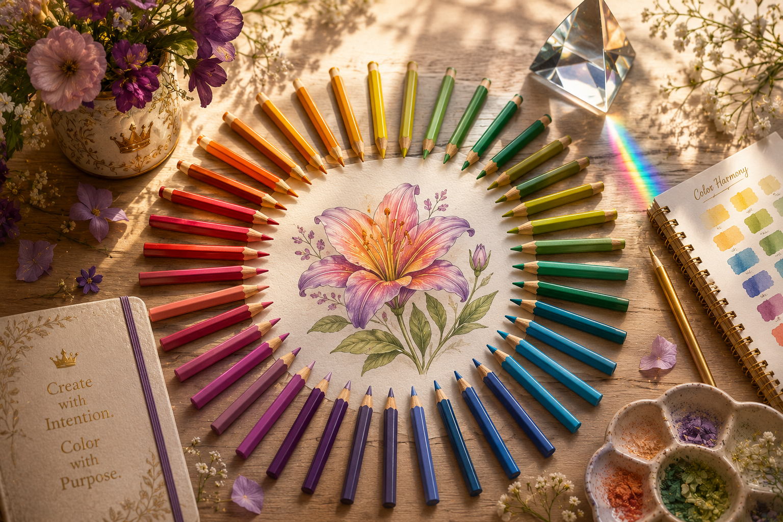
Take twelve colored pencils.
Arrange them in a circle.
Don’t worry about making it perfect.
Simply group similar colors together.
Notice how naturally the colors begin flowing from one to another.
You’re creating your own Color Compass™.
Exercise 2 – Warm and Cool Hunt
Choose one Escape Kingdom coloring page.
Using only your eyes, identify:
- five areas that could feel warmer,
- five areas that could feel cooler.
Don’t color anything yet.
Simply practice observing.
Exercise 3 – Nature’s Color Wheel
Find one flower or photograph of a flower.
Instead of naming the main color, identify:
- the warmest area,
- the coolest area,
- the brightest area,
- the darkest area.
You’ll begin noticing that even simple flowers contain remarkable color variety.
Common Beginner Mistakes
❌ Thinking every green is the same
Some greens feel warm.
Others feel cool.
Learning the difference creates much more believable landscapes and leaves.
❌ Ignoring neighboring colors
Many beginners jump between unrelated colors too quickly.
The color wheel reminds us that smooth transitions often create more harmonious artwork.
❌ Believing the wheel is a set of rules
The color wheel is a guide—not a limitation.
It helps you understand possibilities.
It doesn’t decide for you.
✨ Creative Insight
Color theory isn’t about finding the “correct” color.
It’s about making intentional choices.
Two artists can color the same flower using completely different palettes, and both can create beautiful artwork.
The difference is that each artist understands why those colors work together.
That’s the confidence the Color Compass™ is designed to build.
A New Way to See Color
The next time you open a box of colored pencils, don’t think of them as individual pencils.
Think of them as companions.
Some naturally support one another.
Some create exciting contrast.
Some quietly unify everything around them.
Learning those relationships is one of the most enjoyable parts of becoming an artist.
Before long, you’ll stop reaching for random pencils and start building thoughtful color families with confidence.
Coming in Module 3
Now that you know how to navigate the Color Compass™, it’s time to explore one of the most exciting ideas in color theory:
Color Harmony.
You’ll discover:
- why some color combinations feel naturally pleasing,
- how to create beautiful palettes without guessing,
- when to use complementary, analogous, triadic, and split-complementary color schemes,
- and the Escape Kingdom Harmony Builder™, an original framework that transforms color harmony from a confusing theory into a practical tool for every coloring page.
By the end of the next module, choosing beautiful color palettes will feel much less like trial and error—and much more like a creative adventure.
Module 3 – The Escape Kingdom Harmony Builder™: Choosing Colors That Naturally Work Together
Why Some Color Combinations Feel “Right”
Have you ever looked at a sunset and thought,
“Those colors are absolutely beautiful together.”
Or admired a butterfly whose wings seemed perfectly balanced?
Nature has an incredible way of combining colors that feel harmonious.
The exciting part is that this isn’t random.
Many of those beautiful combinations follow simple relationships that artists have used for centuries.
This doesn’t mean every beautiful painting follows a strict formula.
It simply means that understanding these relationships gives you a wonderful starting point whenever you’re unsure which colors to choose.
Think of color harmony like preparing a delicious meal.
The ingredients matter.
But so does how they work together.
One ingredient rarely creates the entire experience.
It’s the combination that makes it memorable.
✨ Creative Insight
Color harmony isn’t about finding the perfect palette.
It’s about creating a palette where every color supports the others.
When colors work together, your eye moves comfortably around the artwork instead of getting distracted by unexpected clashes.
The Escape Kingdom Harmony Builder™
Instead of memorizing complicated color theory diagrams, ask yourself four simple questions.
① Do I want my artwork to feel peaceful?
↓
Choose Neighboring Colors
② Do I want it to feel vibrant?
↓
Choose Opposite Colors
③ Do I want it to feel energetic?
↓
Choose Balanced Trios
④ Do I want it to feel rich and sophisticated?
↓
Choose Gentle Contrast
Those four questions will guide most of your color choices.
🌿 Harmony Style One – Neighboring Colors
Artists often call these analogous colors.
They sit beside one another on the color wheel.
Imagine:
Yellow
↓
Yellow-Green
↓
Green
↓
Blue-Green
These colors naturally blend into one another.
They’re perfect when you want your artwork to feel:
- calm,
- natural,
- relaxing,
- elegant.
Perfect For
- botanical coloring pages,
- forests,
- tropical leaves,
- underwater scenes,
- rolling landscapes.
🌿 Nature’s Lesson
Look at a tropical rainforest.
You won’t find just one green.
You’ll discover dozens of neighboring greens working together beautifully.
Nature is constantly demonstrating analogous color harmony.
🌟 Harmony Style Two – Opposite Colors
Artists call these complementary colors.
They sit opposite one another on the color wheel.
Examples include:
- Blue ↔ Orange
- Red ↔ Green
- Yellow ↔ Violet
At first this sounds surprising.
Wouldn’t opposite colors clash?
Actually…
When used thoughtfully, they make one another appear brighter.
Example
Imagine a bright yellow sunflower.
If you add tiny violet shadows between the petals…
The yellow suddenly appears even more luminous.
The violet isn’t competing with the yellow.
It’s helping the yellow shine.
👑 Royal Artist’s Tip
Complementary colors work best when one color leads and the other supports.
Think of them as partners—not competitors.
🎨 Harmony Style Three – Balanced Trios
Artists call these triadic color schemes.
Instead of choosing two colors, you select three that are evenly spaced around the color wheel.
One familiar example is:
- Red
- Yellow
- Blue
Another is:
- Orange
- Green
- Violet
Triadic palettes feel:
- playful,
- energetic,
- balanced,
- imaginative.
Perfect For
- fantasy illustrations,
- whimsical animals,
- storybook scenes,
- playful floral arrangements.
🌸 Harmony Style Four – Gentle Contrast
This approach is sometimes called a split complementary palette.
Instead of choosing one direct opposite, you choose the two colors beside it.
Imagine your main color is blue.
Instead of pairing it only with orange…
You might choose:
- Yellow-Orange
- Red-Orange
The result feels:
- softer,
- more flexible,
- less dramatic,
- easier for beginners to use.
✨ Creative Insight
If you’re just beginning your color theory journey, Gentle Contrast is one of the easiest ways to create exciting palettes without making your artwork feel overwhelming.
Choosing the Right Harmony
You don’t need to memorize every harmony type.
Instead, ask yourself one simple question:
How do I want this artwork to feel?
If you want…
Calm
Choose neighboring colors.
Bold
Use complementary colors.
Playful
Choose triadic colors.
Elegant
Use gentle contrast.
Emotion comes first.
The palette follows.
Harmony in Escape Kingdom
Think about the different areas of Escape Kingdom.
Each naturally lends itself to different harmony styles.
🌸 Botanical Coloring Pages
Mostly neighboring colors with subtle complementary accents.
👑 Afrocentric Fantasy Beauty
Rich jewel tones with gentle complementary contrasts.
🦋 Fantasy Butterflies
Triadic palettes can create magical, vibrant wings.
🌿 Cottage Garden Collections
Soft neighboring palettes with warm highlights.
🌌 Dreamlike Fantasy Scenes
A blend of cool analogous colors with carefully placed complementary focal points.
This is one reason color harmony is so exciting—it helps tell the story of the artwork before a single word is written.
Escape Kingdom Practice Studio
Exercise 1 – One Flower, Four Moods
Print one flower coloring page.
Color it four different ways.
Version One
Neighboring Colors
How does it feel?
Version Two
Complementary Colors
How does it change?
Version Three
Triadic Palette
Does it feel more energetic?
Version Four
Gentle Contrast
Which version feels most elegant?
This simple exercise trains your artistic eye far more effectively than memorizing color charts.
Exercise 2 – Color Detective
Find three photographs.
One peaceful.
One exciting.
One dramatic.
Without looking at the subject itself, study only the colors.
Ask:
- Which harmony style is being used?
- Which color dominates?
- Which colors quietly support it?
You’ll begin noticing color harmony everywhere.
Exercise 3 – Build a Personal Palette
Choose one favorite colored pencil.
Instead of asking,
“What matches this?”
Ask,
“Which colors help this one become even more beautiful?”
Create a palette of five pencils that feel harmonious together.
Keep it as your own “signature palette.”
Common Harmony Mistakes
❌ Using Every Bright Color
Too many equally strong colors compete for attention.
Choose one or two stars.
Let the others support them.
❌ Ignoring Mood
A peaceful forest and a magical dragon don’t need the same palette.
Think about the feeling before choosing the colors.
❌ Thinking Harmony Means Boring
Harmony doesn’t mean every color looks similar.
It means the colors feel as though they belong together.
🌿 Reflection
Beautiful coloring isn’t about finding the “right” colors.
It’s about creating relationships.
Each pencil contributes something to the story you’re telling.
Sometimes that story is peaceful.
Sometimes it’s dramatic.
Sometimes it’s joyful.
The colors themselves become part of the artwork’s voice.
As you practice, you’ll spend less time asking,
“Do these colors match?”
and more time asking,
“Do these colors tell the story I want to tell?”
That’s one of the most rewarding shifts you can make as a colorist.
🌟 Practice Prompt
Before your next coloring session, choose your palette before you begin.
Lay out five to seven pencils on your desk.
Spend a minute looking at them together.
Ask yourself:
- Which one is the main character?
- Which ones provide support?
- Which one adds surprise?
- Which one ties everything together?
This simple habit will make your coloring feel more intentional from the very first stroke.
Coming in Module 4
Now that you’ve learned how colors work together, it’s time to understand why the same color can look completely different depending on its surroundings.
In the next module, you’ll explore:
- warm and cool versions of the same color,
- value (lightness and darkness),
- saturation (brightness and intensity),
- atmospheric color,
- and the Escape Kingdom Color Layers™, a practical framework for combining color temperature, value, and saturation to create artwork with greater depth, realism, and emotion.
By the end of the next module, you’ll begin seeing colors not as fixed choices, but as flexible tools that can completely transform the mood and impact of your artwork.
Module 4 – Beyond the Color Wheel: Temperature, Value & Saturation Made Simple
Why Two Blue Pencils Can Look Completely Different
Imagine opening a new box of colored pencils.
You find two pencils that both say Blue.
At first glance, they seem almost identical.
But when you color with them, one feels bright and sunny, while the other feels cool and peaceful.
How can that be?
Because color isn’t defined by hue alone.
Every color has three important characteristics that influence how it looks and how it makes us feel:
- Temperature
- Value
- Saturation
Understanding these three ideas is one of the biggest steps toward choosing colors confidently.
The good news is that they’re much simpler than they sound.
🌈 Every Color Has Three Personalities
Think of every color as having three different personalities.
🌡 Temperature
Is the color warm or cool?
🌗 Value
Is the color light or dark?
💎 Saturation
Is the color bright and vivid, or soft and muted?
Once you begin noticing these three qualities, you’ll stop choosing colors by name alone.
Instead, you’ll begin choosing them by the feeling they create.
🌞 Understanding Color Temperature
You’ve already learned that some colors naturally feel warm while others feel cool.
But here’s something even more interesting.
Almost every color can have both warm and cool versions.
For example:
A blue with a slight hint of green often feels warmer.
A blue with a touch of violet usually feels cooler.
Neither is better.
Each simply creates a different mood.
🌿 Nature’s Lesson
Look at the ocean throughout the day.
Morning water may appear cool and blue-violet.
By sunset, the same water can reflect warm turquoise and golden blues.
The water hasn’t changed.
The light has.
Artists often use this idea to create atmosphere and emotion.
Using Temperature to Tell a Story
Temperature helps guide the viewer’s emotions.
Warm palettes often feel:
- cheerful,
- energetic,
- welcoming,
- adventurous,
- sunlit.
Cool palettes often feel:
- peaceful,
- mysterious,
- refreshing,
- dreamy,
- calm.
Neither is “correct.”
Choose the one that supports the story you’re trying to tell.
👑 Royal Artist’s Tip
Before selecting your colors, ask yourself:
“How should this artwork feel?”
The answer often tells you whether to begin with warmer or cooler colors.
Understanding Value
Value simply describes how light or how dark a color is.
Many beginners believe color creates depth.
In reality…
Value creates most of the depth.
Imagine converting a beautiful painting into black and white.
Even without color, you’d still recognize:
- highlights,
- shadows,
- shapes,
- distance,
- texture.
That’s because value remains.
Why Value Matters
Without value differences:
Flowers appear flat.
Leaves lose their shape.
Hair lacks movement.
Clouds become lifeless.
With thoughtful value changes, even a simple coloring page suddenly begins to feel three-dimensional.
✨ Creative Insight
If your artwork ever feels flat, don’t immediately reach for a new color.
Instead, ask yourself:
“Do I need more value contrast?”
Very often, the answer is yes.
The Escape Kingdom Light Path™
When coloring almost any object, imagine a simple journey.
Bright Highlight
        ↓
Light
        ↓
Midtone
        ↓
Shadow
        ↓
Deep Shadow
Instead of thinking only about colors…
Think about light moving across the object.
This simple habit creates much more believable artwork.
Understanding Saturation
Saturation describes how intense a color appears.
Imagine a ripe tropical hibiscus flower.
Its petals are bold and vivid.
That’s high saturation.
Now imagine the same flower after several days in the sun.
The color appears softer.
More faded.
That’s lower saturation.
Neither version is wrong.
They’re simply expressing different moods.
High Saturation
Feels:
- exciting,
- playful,
- energetic,
- bold.
Perfect for:
- butterflies,
- tropical flowers,
- fantasy creatures,
- celebrations.
Lower Saturation
Feels:
- gentle,
- elegant,
- vintage,
- peaceful.
Perfect for:
- botanical studies,
- cottage gardens,
- antique illustrations,
- relaxing coloring pages.
🌿 Nature’s Lesson
Notice how nature rarely makes everything equally bright.
One flower becomes the star.
The surrounding leaves become quieter.
This contrast naturally guides your eye.
You can use exactly the same idea in your coloring.
Combining Temperature, Value & Saturation
Now imagine coloring a rose.
Instead of simply asking,
“Which red should I use?”
You begin asking richer questions.
Should this rose feel:
- warm or cool?
- bright or soft?
- light or dramatic?
Suddenly, you’re making artistic decisions rather than simply choosing pencils.
That’s where confidence begins to grow.
The Escape Kingdom Color Layers™
Every successful coloring page combines these three ideas.
Layer 1
Choose the Temperature

↓

Layer 2
Build the Value

↓

Layer 3
Adjust the Saturation

↓

Finished Artwork
Notice that color isn’t just about hue anymore.
Each layer has a purpose.
Escape Kingdom Practice Studio
Exercise 1 – Warm vs Cool
Draw two identical flowers.
Color one using mostly warm colors.
Color the other using mostly cool colors.
Compare how each version feels emotionally.
Exercise 2 – Value Without Changing Color
Choose one blue pencil.
Create a gradient from the lightest possible blue to the darkest possible blue using only pressure and layering.
This teaches your eye to recognize value independently of hue.
Exercise 3 – Saturation Explorer
Choose one tropical flower.
Create three versions.
Version One
Very vivid colors.
Version Two
Moderately saturated colors.
Version Three
Soft, muted colors.
Ask yourself:
Which version feels peaceful?
Which feels energetic?
Which best suits the mood you wanted to create?
Common Beginner Mistakes
❌ Confusing Color with Value
Adding a new color doesn’t always solve a value problem.
Sometimes the same color simply needs to become lighter or darker.
❌ Making Everything Bright
If every color is equally vivid, nothing becomes the focal point.
Allow some colors to quietly support the stars of your composition.
❌ Ignoring Temperature
Warm and cool variations create depth and atmosphere.
Choosing only one temperature can make artwork feel less dynamic.
❌ Chasing Realism Too Soon
Don’t worry about perfectly matching every color.
Focus first on creating believable relationships between temperature, value, and saturation.
Realism naturally follows.
🌿 Reflection
Color is much more than choosing beautiful pencils.
It’s about understanding how light, warmth, and intensity work together.
Once you begin seeing every color through these three qualities, you’ll notice something wonderful.
The world becomes more colorful.
Not because new colors suddenly appear…
But because you begin noticing the subtle differences that were always there.
That’s one of the greatest gifts of studying color theory.
It teaches you to observe more carefully—not just when you’re coloring, but everywhere you look.
💡 Helpful Hint
The next time you’re outside, choose one flower.
Instead of asking,
“What color is it?”
Ask yourself:
- Is it warm or cool?
- Is it light or dark?
- Is it vivid or soft?
You may discover that a single flower contains far more variety than you ever imagined.
Coming in Module 5
Now that you understand temperature, value, and saturation, it’s time to bring everything together in real coloring projects.
In the next module, you’ll discover the Escape Kingdom Color Planning Workflow™, a simple step-by-step system for choosing complete color palettes before you begin coloring.
You’ll also learn:
- how to build harmonious palettes with confidence,
- how to avoid muddy color combinations,
- how to create focal points naturally,
- and how professional artists make color decisions long before the first pencil touches the paper.
This practical workflow will help transform color theory from interesting knowledge into a skill you can confidently use on every Escape Kingdom coloring page.
Module 5 – The Escape Kingdom Color Planning Workflow™: Choosing Beautiful Color Palettes with Confidence
Great Coloring Begins Before the First Pencil Stroke
Have you ever started coloring with excitement, only to stop halfway through because something didn’t look quite right?
Perhaps the colors seemed disconnected.
Maybe the flower looked too busy.
Or perhaps you kept changing your mind about which pencil to use next.
If you’ve experienced this, you’re not alone.
One of the simplest ways to improve your coloring isn’t learning a new technique.
It’s learning to make your color decisions before you begin.
Professional artists rarely reach into their pencil case and choose colors one at a time.
Instead, they spend a few quiet moments planning.
That small investment of time often leads to artwork that feels more balanced, harmonious, and intentional.
🌿 Why Color Planning Matters
Imagine baking a cake.
Would you start mixing ingredients without first deciding which recipe you’re making?
Probably not.
Coloring works the same way.
When you begin with a clear palette, each new layer supports the overall vision instead of competing with it.
Planning doesn’t limit creativity.
It creates confidence.
And confidence allows creativity to flourish.
🎨 The Escape Kingdom Color Planning Workflow™
Whenever you begin a new coloring page, move through these six simple steps.
Observe
      ↓
Imagine
      ↓
Choose
      ↓
Test
      ↓
Adjust
      ↓
Color
This workflow works whether you’re coloring a single flower or an intricate fantasy illustration.
👀 Step 1 – Observe
Before choosing any pencils, spend a minute looking at the artwork.
Ask yourself:
- What is the main subject?
- Where does your eye naturally go?
- What mood does the illustration suggest?
- Where might the light be coming from?
Don’t rush.
Observation is the foundation of thoughtful color choices.
✨ Step 2 – Imagine
Now picture the finished artwork in your mind.
Ask yourself:
Would I like it to feel:
- bright and cheerful?
- soft and peaceful?
- dramatic and mysterious?
- warm and inviting?
- magical and imaginative?
The mood should guide the palette.
Not the other way around.
🌿 Nature’s Lesson
Think about the difference between:
- a sunny tropical garden,
- an autumn woodland,
- and a moonlit forest.
All three may contain flowers and leaves.
Yet each uses completely different color relationships to create its atmosphere.
🖍 Step 3 – Choose
Now select your pencils.
Instead of choosing twenty colors, begin with five to seven.
A smaller palette often creates more harmonious artwork.
A simple example for a botanical illustration might include:
- Cream
- Light Yellow
- Yellow Green
- Olive Green
- Rose Pink
- Deep Plum
Notice how every pencil has a purpose.
💡 Helpful Hint
Lay your chosen pencils on your desk before you begin.
Simply seeing them together often reveals whether they feel harmonious.
If one pencil immediately feels out of place, trust your instincts and replace it.
📝 Step 4 – Test
Before coloring the page, make a few quick swatches on scrap paper.
Try:
- layering two colors,
- blending neighboring colors,
- testing your shadow color,
- checking your highlight color.
This takes only a few minutes but can prevent much bigger mistakes later.
🎨 Step 5 – Adjust
Now evaluate your swatches.
Ask yourself:
- Does this palette feel too warm?
- Should it be brighter?
- Are the shadows too harsh?
- Is there enough contrast?
- Does one color dominate too much?
Small adjustments now save a great deal of frustration later.
🌸 Step 6 – Color with Confidence
Only now is it time to begin.
Instead of constantly wondering which pencil comes next, you can simply enjoy the coloring process.
Your attention shifts from decision-making to observation, layering, and creativity.
That’s where coloring becomes truly relaxing.
Creating a Balanced Palette
One of the easiest ways to improve your artwork is to think in terms of roles rather than individual colors.
Every palette benefits from having colors that perform different jobs.
🌞 The Main Color
This is the color your artwork will be remembered for.
Examples:
- pink for a rose,
- blue for a butterfly,
- green for tropical leaves.
Choose one clear star.
🌿 Supporting Colors
These strengthen the main color without competing with it.
They often include neighboring colors and gentle neutrals.
🌙 Shadow Colors
These create depth.
Instead of automatically choosing black, consider:
- deeper versions of the main color,
- complementary colors,
- cool or warm shadow tones.
✨ Accent Colors
Accent colors are used sparingly.
They attract attention and guide the viewer’s eye.
Because they’re used in small amounts, they often become some of the most memorable parts of the artwork.
🌿 Nature’s Lesson
Imagine a tropical hibiscus.
The flower captures your attention.
The leaves quietly support it.
The background provides breathing room.
Nature rarely asks every element to compete equally.
Your coloring shouldn’t either.
Escape Kingdom Practice Studio
Exercise 1 – Three Mood Palettes
Choose one coloring page.
Without coloring it, create three different palettes.
Palette One
Warm and cheerful.
Palette Two
Cool and peaceful.
Palette Three
Bold and dramatic.
Which one best suits the illustration?
There isn’t one correct answer.
The goal is to explore possibilities.
Exercise 2 – Five Pencil Challenge
Choose only five pencils.
Complete a small section of a coloring page using only those five colors.
This exercise encourages thoughtful layering rather than constantly reaching for new pencils.
Exercise 3 – Build Around One Color
Choose your favorite colored pencil.
Now select four additional pencils that help it shine.
Think of your favorite pencil as the main character.
The other colors should support—not overshadow—it.
Common Color Planning Mistakes
❌ Choosing Too Many Colors
A limited palette often feels more cohesive.
❌ Ignoring the Mood
Ask how you want the artwork to feel before selecting your pencils.
❌ Skipping Swatches
Testing colors first is much easier than correcting mistakes later.
❌ Letting Every Color Compete
Not every pencil needs equal attention.
Some colors should quietly support the stars of your composition.
❌ Changing Direction Constantly
Making small adjustments is helpful.
Completely reinventing your palette halfway through usually creates inconsistency.
✨ Studio Secret
Professional-looking artwork often uses fewer colors than you think.
The richness comes from layering, thoughtful planning, and repeating colors throughout the page—not from using every pencil in the box.
Repeating the same colors in different parts of an illustration quietly ties everything together and creates a pleasing sense of unity.
🌿 Reflection
Color planning isn’t about removing spontaneity.
It’s about giving your creativity a strong foundation.
When you begin with a clear vision, every decision becomes easier.
You’ll spend less time wondering,
“What should I do next?”
and more time enjoying the process of bringing your artwork to life.
Over time, planning becomes second nature.
You’ll naturally begin seeing palettes before your pencils even touch the paper.
And that’s one of the quiet signs that your artistic confidence is growing.
🖌 Practice Prompt
Before your next coloring session, spend five minutes creating a simple palette card.
Choose:
- one main color,
- two supporting colors,
- one shadow color,
- one accent color.
Place the pencils beside one another and simply observe.
Ask yourself:
“Does this palette tell the story I want my artwork to tell?”
You may find that those five minutes become one of the most valuable parts of your creative routine.
Coming in Module 6
In the final module, we’ll bring everything together with:
- The Escape Kingdom Color Confidence Checklist™
- A simple troubleshooting guide for common color problems
- Frequently asked questions about color theory
- The biggest myths about choosing colors
- A complete summary of the most important ideas from this guide
- Practical next steps for continuing your creative journey
- Related Creative Lab and Royal Library resources
- Printable worksheet ideas to strengthen your understanding of color
By the end of the final module, you’ll have a clear, practical understanding of color theory—not as a collection of rules, but as a creative toolkit you can confidently use every time you pick up your colored pencils.
Module 6 – Color with Confidence: Troubleshooting, Frequently Asked Questions & Your Next Creative Adventure
Congratulations!
You’ve just completed one of the most valuable creative skills you’ll ever learn.
Color theory can seem intimidating at first, but you’ve discovered something important:
It’s not about memorizing complicated rules.
It’s about learning to see colors differently.
You now understand:
- how the color wheel helps you make better decisions,
- why some colors naturally work well together,
- how warm and cool colors influence mood,
- why value creates depth,
- how saturation changes the feeling of an illustration,
- and how thoughtful color planning can transform your artwork before the first pencil even touches the paper.
Most importantly, you’ve learned that choosing colors isn’t about guessing.
It’s about observing, experimenting, and trusting your growing artistic instincts.
🌈 The Escape Kingdom Color Confidence Checklist™
Before beginning your next coloring page, take a moment to ask yourself these simple questions.
🎨 Palette
☐ Have I chosen a clear main color?
☐ Do my supporting colors work naturally with it?
☐ Have I limited my palette to avoid unnecessary clutter?
☀ Mood
☐ How do I want this artwork to feel?
☐ Do my colors support that feeling?
☐ Are my warm and cool colors balanced intentionally?
🌿 Depth
☐ Have I planned highlights?
☐ Have I planned shadows?
☐ Will my values create enough contrast?
✨ Harmony
☐ Do my colors feel connected?
☐ Is one color acting as the main focus?
☐ Are accent colors being used sparingly?
👀 Final Check
☐ Am I choosing colors intentionally rather than randomly?
If you can answer “yes” to most of these questions, you’re already thinking like an artist.
🌿 Common Color Problems (and Simple Solutions)
Every artist encounters moments when a coloring page doesn’t quite look the way they imagined.
The encouraging news is that most color problems have straightforward solutions.
| If your artwork… | Try this instead… |
|---|---|
| Feels flat | Increase the difference between your lightest highlights and darkest shadows. |
| Feels too busy | Reduce the number of dominant colors and allow one to become the focus. |
| Looks muddy | Simplify your palette and layer more thoughtfully instead of adding unrelated colors. |
| Feels lifeless | Introduce subtle warm and cool variations within the same object. |
| Seems unbalanced | Repeat a few colors in different parts of the page to create unity. |
| Doesn’t draw the eye anywhere | Add one carefully placed accent color to create a natural focal point. |
✨ Creative Insight
When something feels “off,” resist the urge to immediately start over.
Instead, pause and ask:
“What is this artwork trying to tell me?”
Very often, the answer isn’t another pencil.
It’s a small adjustment in contrast, temperature, or balance.
Five Color Myths Worth Leaving Behind
Myth 1
“There is one correct color for everything.”
Nature disagrees.
A leaf can contain yellow-green, olive, blue-green, and even hints of brown.
The goal isn’t perfection.
It’s believability.
Myth 2
“Bright colors always make better artwork.”
Brightness attracts attention.
If everything is equally bright, nothing becomes special.
Let some colors quietly support the stars of your composition.
Myth 3
“Color theory limits creativity.”
The opposite is true.
Understanding color relationships gives you more freedom to experiment confidently.
Myth 4
“I need hundreds of pencils to create beautiful artwork.”
Many stunning illustrations are created with surprisingly limited palettes.
Thoughtful choices matter far more than quantity.
Myth 5
“Professional artists never make color mistakes.”
They do.
The difference is that they understand how to adjust, adapt, and learn from those moments.
Every coloring page teaches something new.
Frequently Asked Questions
Do I need to memorize the color wheel?
No.
The more you use it, the more familiar it becomes naturally.
Think of it as a helpful reference rather than something you must memorize.
How many colors should I use on one coloring page?
There isn’t a fixed number.
Many beautiful illustrations are completed using just five to eight carefully chosen colors, layered in different ways.
Start simple.
You can always introduce additional colors later if the artwork needs them.
What if I don’t like the colors I’ve chosen?
Don’t be discouraged.
Before making major changes, ask yourself:
- Could another layer improve this area?
- Would a subtle shadow add more depth?
- Would repeating one color elsewhere create better balance?
Sometimes a small adjustment completely changes how the artwork feels.
Can I invent my own color palettes?
Absolutely.
Color theory isn’t about copying someone else’s choices.
It’s about giving you the confidence to create your own.
Some of the most memorable artwork comes from unexpected—but thoughtful—combinations.
Is realistic coloring always the goal?
Not at all.
Some artists enjoy realism.
Others prefer whimsical, imaginative, or expressive color.
Color theory supports every style because it focuses on relationships rather than rigid rules.
👑 Royal Artist’s Tips
As you continue your creative journey, remember these simple ideas.
🎨 Observe First
Nature is one of the greatest color teachers you’ll ever have.
Spend time looking before choosing pencils.
🌿 Build Relationships
Think about how colors work together rather than judging them individually.
✨ Stay Curious
Every coloring page is an opportunity to try something new.
Experiment with warmth.
Experiment with harmony.
Experiment with mood.
There are no wasted pages—only learning experiences.
🌞 Let Light Guide You
Instead of asking,
“What color is this?”
Ask,
“How is the light changing this color?”
That one question can transform the way you see the world.
Your Creative Journey Continues
Color theory isn’t the destination.
It’s one of the tools that helps you enjoy the journey.
Now that you understand how colors interact, you’re ready to build on this knowledge with even more practical techniques.
A natural next step is learning how to blend the colors you’ve so carefully chosen and layered.
Continue Exploring the Creative Lab
Your recommended learning path is:
✔ How to Hold Colored Pencils
↓
✔ Understanding Pencil Pressure
↓
✔ How to Layer Colors
↓
✔ Color Theory Explained Simply
↓
➡ How to Blend Colored Pencils
↓
Creating Smooth Color Transitions
↓
Avoiding Common Coloring Mistakes
↓
Coloring Your First Complete Page
Each guide builds naturally on the last, helping you develop lasting skills with confidence.
Explore More Creative Inspiration
As you continue exploring Escape Kingdom, you may also enjoy:
🎨 Creative Lab
- Choosing the Right Colored Pencils
- Best Paper for Coloring Pages
- Wax vs. Oil Colored Pencils
- Best Beginner Supplies
- Colored Pencils vs. Markers
- Printing Coloring Pages at Home
🌿 Inspiration Kingdom
When you browse artwork in Inspiration Kingdom, challenge yourself to notice:
- warm and cool color relationships,
- harmonious palettes,
- subtle shadows,
- vibrant focal points,
- repeating colors that create unity.
You’ll begin seeing these ideas everywhere.
📚 Creative Lab
For even more creative inspiration, explore articles about:
Technical skills and creative confidence grow beautifully together.
🌸 Practice Prompt
The next time you complete a coloring page, don’t put it away immediately.
Instead, spend one minute reflecting.
Ask yourself:
- Which color combination surprised me?
- Which area feels the most harmonious?
- What would I try differently next time?
- Which new idea from this guide helped the most?
Those quiet moments of reflection often become your greatest teacher.
A Final Thought
The world is filled with extraordinary color.
Morning skies.
Rain-soaked leaves.
Butterfly wings.
Sunlit petals.
Color theory doesn’t ask you to copy those things perfectly.
It simply teaches you to notice them more deeply.
The more carefully you observe, the more confidently you’ll create.
And before long, you’ll discover something wonderful.
You’ll stop asking,
“Which colors should I use?”
and begin asking,
“What story do I want these colors to tell?”
That’s when coloring becomes more than a hobby.
It becomes a way of expressing how you see the world.
🌿 Before You Begin Your Next Page…
Take a slow look at your colored pencils.
Not as individual tools…
But as a collection of possibilities.
Every color has its own personality.
Every combination tells a different story.
Every coloring page is an opportunity to discover something new.
Trust your curiosity.
Enjoy the process.
And remember:
The most beautiful color palettes aren’t always the boldest—they’re the ones that tell the story you want to share.